
You can have the best message in the world—but if your slides, social posts, or flyers look cluttered and inconsistent, people won’t hear it.
Design is a form of communication. It’s about making sure what you’re trying to say actually gets through. Unfortunately, small churches often trip over the same few design habits that make everything feel a little… off.
So today, let’s talk through some practical church graphic design tips that can help your visuals look cleaner, clearer, and more intentional.
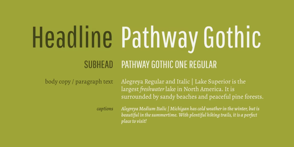
1. Keep Fonts Simple and Consistent
Fonts are like voices—each one has a personality. When you use seven at once, it’s like having a room full of people all talking over each other.
Here’s one of the simplest church graphic design tips you can apply today:
Pick two or three fonts and stick with them.
- One for headlines
- One for body text
- One optional accent
That’s it. It’ll instantly make your designs look more polished and professional.

Recent color palette for a church in the Southwest. They wanted a vibrant palette that would reflect their location and draw more young families.
2. Choose a Consistent Color Palette
Ever seen a church that uses navy blue one week, bright teal the next, and burnt orange after that? It’s like changing your logo every Sunday.
A reliable color palette builds trust. Choose two to five colors that fit your church’s personality, and use them everywhere.
Consistency doesn’t mean boring—it means recognizable and confident.


3. Limit Text and Focus on Clarity
If you need to shrink your font size to 8pt to fit everything in, you’re doing too much.
One of the best church graphic design tips is this: a graphic’s job is to catch attention, not tell the whole story.
Keep it short and clear—just the headline, date, and where to get more info (like your website or a QR code). Your audience will actually read it—and remember it.
4. Prioritize Contrast for Readability
Light gray text on a white background might look subtle on your laptop, but from the back row, it’s invisible.
Contrast is what makes text readable. Use dark text on light backgrounds or light text on dark backgrounds.
If people can’t read your slide, they can’t respond to your message.
5. Respect Alignment and Spacing
Good design is mostly about order. When things are misaligned or crammed together, the eye knows something’s off—even if your audience can’t say why.
Leave space. Line things up. Give your content room to breathe.
White space isn’t empty—it’s clarity.

Photography style I recently developed for a church with a large military population. The goals was family oriented, candid, welcoming imagery.
6. Use Modern, Authentic Imagery
It’s time to retire the glowing cross silhouettes and generic stock photos of people awkwardly smiling at nothing.
Modern church graphic design tips often emphasize authenticity:
Use photos of your own people when possible. If not, choose free, modern stock photos from sites like Unsplash or Pexels.
People connect with what feels real.
Lightstock (not a sponsor) has great, uncheesey subscription based imagery for churches. Pexels.com and pixabay.com are some other great free options.
Final Thought
Avoiding design mistakes isn’t about being slick—it’s about communicating with them.
When your visuals are consistent, clear, and calm, they amplify your message instead of distracting from it.
So keep it simple, align your stuff, and please—no Comic Sans.
Your graphics don’t have to be perfect. They just have to help your message be heard.
✅ Bonus: Quick Church Graphic Design Tips to Remember
- Keep fonts under control.
- Stick to a color palette.
- Simplify text.
- Prioritize contrast.
- Use authentic images.
When design supports your message—not competes with it—the Good News shines through.


